Tess and Michael's place
- Jordan Pinto
- Nov 20, 2022
- 3 min read
Updated: Feb 6, 2023
Walk out onto the bridge and you’re among the treetops.
Take in the serenity and connect with the local wildlife - koalas, possums, just to name a few.
No, this is not an ad for an exclusive nature retreat. This is Tess and Michael’s house in the Adelaide Hills.
“A bridge may seem extravagant,” Tess laughs.
“But it was a very logical solution to the site levels and easement.”
And she’s right.
The block Tess, an architect at Max Pritchard Gunner Architects, and husband Michael bought together presented challenges in the form of a steep slope, large easement that bisects through the middle of the land, and a lot of trees.

They believe the same challenges put others in the market off, delivering them the land they would build their first home on, after a long time searching.
“We looked at houses on the market but felt there was too much we'd need to do to them to achieve the quality of life we were after,” Tess explains.
“Michael is from the country and I grew up on a large block size so we were reluctant to spend so much money on a house and property that didn't feel right to us.
“With our backgrounds we were in a unique position to have the skills to start from scratch.”
And we are glad it was them.
With the beautiful landscape at the forefront of her thinking, Tess designed a home that sits comfortably in its surrounding – not dominate it.
“The house is two-storey because of the slope and the many trees on the block. Doing it like this meant we could minimise our footprint without needing to do extensive earthworks,” she says.
It all started about 12 months after they bought the block.
“Those years are a little blurry now so I can't quite remember, I think we started building maybe a year after purchasing,” Tess recalls.
She was 22 and only a year out of university.
So, yeah, same.


That bridge, with its herb garden-lined balustrade, guides you onto the upper level and into the stunning kitchen and living areas.
The interior palette – timber features, white cabinets and black accents – takes a backseat, with the idyllic views catching your eye – and your mind.
“I love the connection to our environment,” Tess explains.
“We are in the treetops and always have koalas, ring tail possums and lorikeets nesting just outside our windows.
“It's pretty special to have a view like that.
“We are not far from the city but when we're home we feel like we're really tucked away from the bustle.
“We are both homebodies so it's important that home feels like a sanctuary."
In this instance, it literally is.


The origami-shaped planes of the roof, along with the windows that raise up with the peaks, take you higher atop the trees and produce a beautiful bouncing light within the living area.
Downstairs, you will find three bedrooms and two bathrooms – all with their own views.
The distinctive folds of the ceiling are emulated in the steel island kitchen bench, which Tess designed and Michael constructed.
“It was quite a unique combination of skills to be able to design what I wanted and he could fabricate it,” Tess says of Michael, who is steel fabricator by trade.
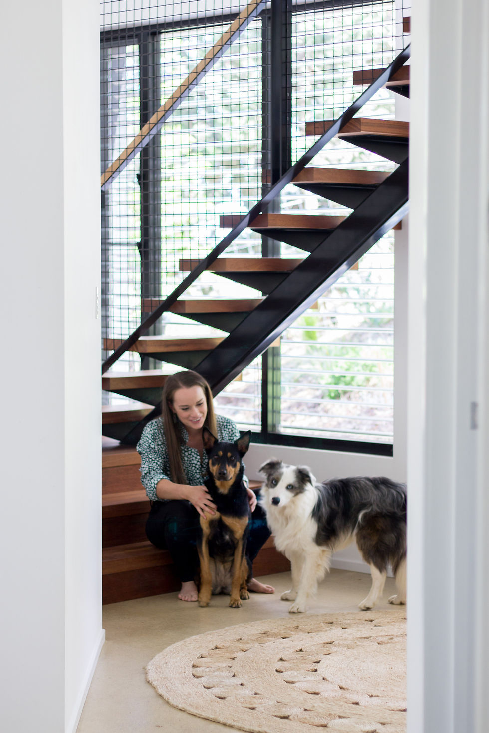
“Michael's skills were also essential with building the stairs, balconies, balustrades and even the kitchen handles.
“We were so lucky to utilise our own skills to do as much of the project ourselves as possible, but we also had to keep realistic and not get carried away with selections.
“We were very budget driven so every choice had to be economical.”
And, unsurprisingly, this place features countless smart design choices.


The north-facing staircase with full-height double glazed windows acts as a ‘winter greenhouse’ reducing the need for heating, while the external venetian blinds help in the hot South Australian summer.
And the corrugated iron roofing and exterior walls, while contemporary in design, help the house as a whole feel right in the landscape.
“It's a pretty big high to see your first real-world design come to life,” Tess says of the project they think will be their forever home.
“I knew I wanted to be sympathetic to the beautiful bush setting but other than that there were no preconceived ideas about what I wanted to design.
“And I wouldn’t change a thing. For that time in our lives we built what we could afford.
“We are pretty proud of what we achieved.”
Words: Jordan Pinto
Curation: Ashleigh Pinto
Photography: Gabrielle Walsh
TESS AND MICHAEL'S PLACE
Built: 2012
Land: 2200m²
Bed: 3
Bath: 2
Architect: Tess Pritchard
WHAT THEIR PLACE TAUGHT THEM
Orientation is crucial.
There is nothing better than a living area with beautiful winter sun. You can have all the fancy finishes but if the orientation isn't right, then the space won't feel right.
Know your skills and your limitations.
Sometimes it's just better to pay someone if it's a really important element.
Comments