Sarah and Nick's place
- Jordan Pinto
- Oct 4, 2021
- 4 min read
Updated: Jan 17, 2022
Live in the sunshine, swim the sea, drink the wild air.
The words hang in the hallway of Sarah and Nick’s home in Adelaide’s south. It’s a poem extract, from one of the most influential thinkers and writers of the 19th century, Ralph Waldo Emerson, about slowing down, connecting and admiring the beauty that surrounds you.
And it describes the couple’s ideals, and thinking behind the renovation of their 1950s house, perfectly.


“It’s a safe haven, a retreat. A place where we can rest, regroup, relax and spend time together,” Sarah says, describing the home’s nature and ocean-inspired remake.
“It means comfort, everything within our space makes us feel blissed out. It really is a place we can escape to and feel happy in. We both work long hours, so when we have down time, it’s so nice to have a place to chill that feels like a holiday.”
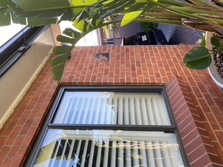
The holiday, paradise island-like vibes are real, too. Light floods the home’s different spaces which are filled with natural, raw textures and organic shapes. And white weatherboard cladding lines the exterior of the house.


But it hasn’t always been a Palekaiko.
That’s the Hawaiian word for paradise, by the way. It’s the name given to the home when the renovation was completed in September this year - 12 months after work began.
“We found a tonne of toothbrushes in the cavity wall of our kitchen during the demo,” says Sarah, who runs Adelaide beauty business The Swoon Effect.

Sarah and Nick, a transport operations manager, bought their first home together in 2011, and they always had plans to renovate. But, while the husband-and-wife team spent years discussing how they wanted their home to flow, early on, they may have been looking too far ahead.
“We didn’t know we had to get utilities on, so we ‘camped’ for two days without electricity,” Sarah laughs.
“I remember walking out to our white bottle brush tree out the front, hugging it and saying ‘I own my own tree’, we were just stoked to have our own little piece of paradise. She was old, neat and simple and we loved her. And wanted to save her.”
So, save her – the house – they did.
The pair had a clear plan. They wanted to keep “the warmth and the soul” of the existing home. A simple layout based around a moderate budget. It was never going to be “big and showy”.


They engaged a building designer, who helped design the extension and devised the plan to push the new kitchen out and wrap around the end of the house.
“It was perfect,” Sarah says. “We could pop our fridge in there along with our coffee machine and close the cavity slider if, and when, we want the main extension to look neat...and also block the noise of the washing machine and dryer in the laundry.”
Because there should be none of that on a holiday, right?
Along with the kitchen, the extension also included the addition of an adjacent living and dining space, alfresco lounge area, pool and deck.


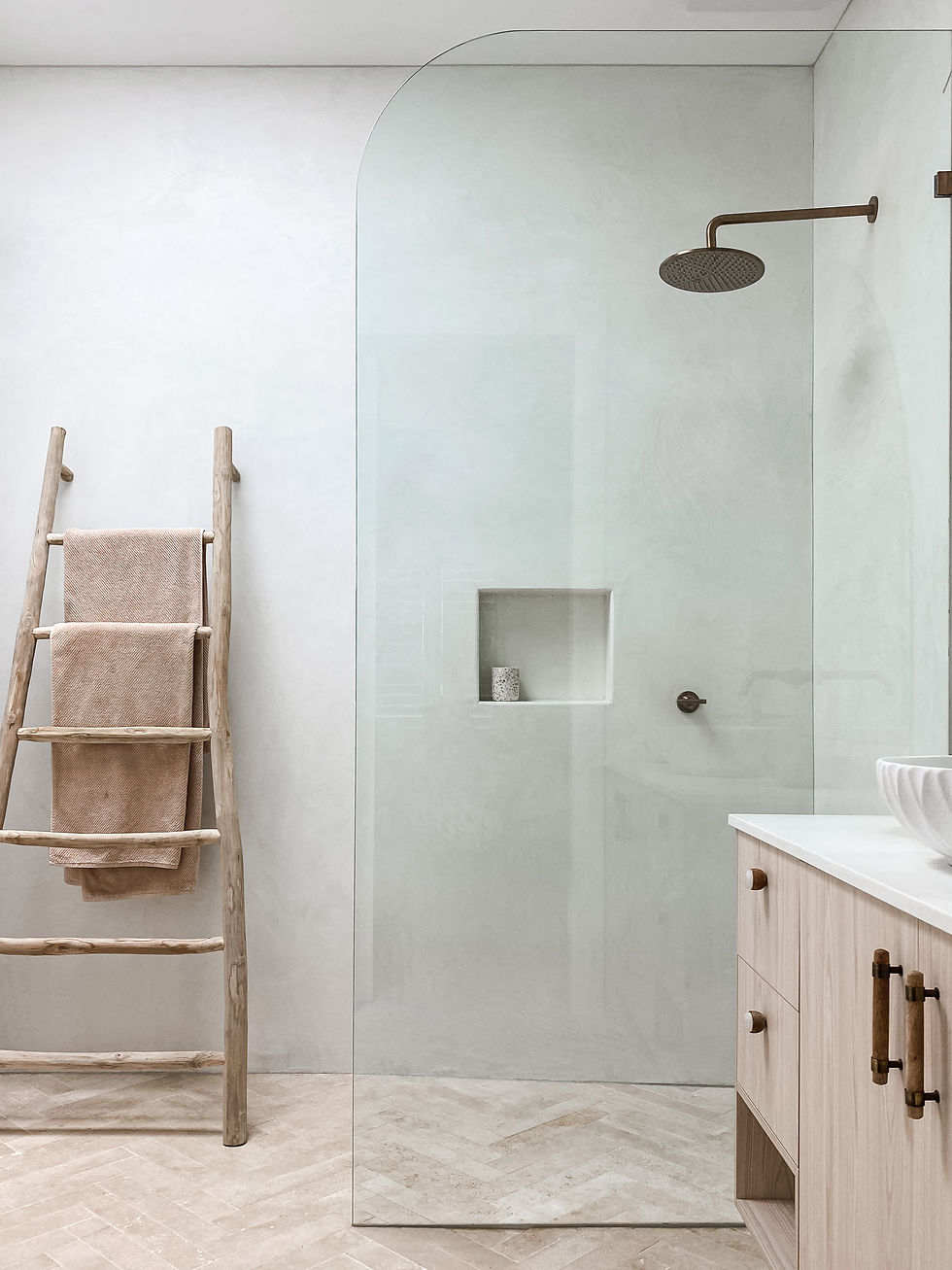
The original lounge was transformed into an extra bedroom, the existing kitchen became a walk-in robe, an ensuite was added and the main bathroom became a retreat in itself.
No, really. The wet room shower is like a holiday.
“I love that holiday villa, day spa feel it offers. Laying back in the bath and being able to look at the stars is pretty cool,” says Sarah.
“I love the idea of just wandering in for a refreshing shower on a balmy evening. If the bath gets wet, who cares? It’s a bath, that’s what they are designed for.”


Magic for Nick is sprawling out in front of the fire with a glass of red.
“Having all the glass doors and porthole window to look out at while standing next to the fire, as the sky lights up with lightning, has been a highlight of winter,” Nick says.
Porthole? Have a look for yourself. It softens the edges of the rest of the extension and adds to the nautical element, which also includes kitchen handles wrapped with natural twine by Nick.
Even more impressive, the fireplace - which stretches all the way up to the raked ceiling - is double-sided, and will eventually face an outdoor entertaining space, filled with daybeds to partner the pool and deck area.


The highlight of summer will then, surely, be cocktails served through the gas strut window, straight from the kitchen bar fridge.
"Big YES," says Sarah, who explains the couple's love for entertaining.
We’re dreaming already. Then the birds, who inhabit the garden, thanks to bird attracting flowers and foliage, wake us up.
“We eventually want to block out as much of the man-made world as possible and create a peaceful haven for wildlife,” says Sarah.
But life doesn’t need to be wild for Nick and Sarah.
"It’s the feeling this house brings, and that quintessential lifestyle of ‘paradise living’ is why we chose the name," she adds.
It fits, imperfectly.

SARAH AND NICK'S PLACE
Post-war double-brick
Built: 1955
Land: 720 m²
Bed: 4
Bath: 2.5
Building Designer: Orangetree Design studio
Builder: Violi Construction
Interior Design: Sarah & Nick worked together to do all the design concepts and Sarah did selections and styling, sourcing mostly online.
WHAT THEIR PLACE TAUGHT THEM
Live in your home for all four seasons before you renovate and work with them to create your spaces.
Time & research are your friends.
Don’t rush your choices and use that time to hunt down those pieces you really love and search the net for bargains. Research.
To make your budget work, if you find something a bit expensive, but you love it, seek ways to bring the budget down in other areas.
In the main bathroom, we used stone floors, but went for an inexpensive matte white tile on the walls. In the kitchen, we opted for two-pack cabinets and stone benches, and in the butlers, we went with laminate cabinetry and bench tops. We shrunk the island bench top ever so slightly, so we could use the same stone slab on bathroom vanities.
DIYers, only attempt what you are capable of. After that, leave it to the professionals or it will end up costing you more money than it's worth.
We were pretty hands-on, mostly to save money and, partly, because, for us, renovating should be a little bit of that. Apart from the little things, Nick built the front gate and we did the front timber fence together. I think you appreciate your home so much more when you get to stand back and see the hard work you’ve put in.
Swipe right to see what their place looked like before and during the renovation


Comments